Trendlines or line of best fit is an important analytical tool to understand and interpret multiple uncorrelated datapoints.
Trendlines can be added to all type of Google Sheet Charts like bar, line, column, scatter etc
In this tutorial lets understand what trendlines are, how to create it and use it.
Table of Contents
What are Trendlines?
rfemner
rken
Inserting a Trendline in Google Sheet
Lets create a Scatter plot and add a trendline over it.
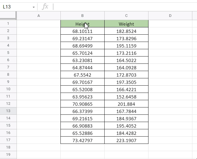
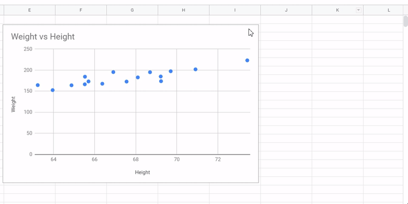
Step 1: Get the data you want to create a Plot with. We have used a sample Height vs Weight data available on Kaggle.

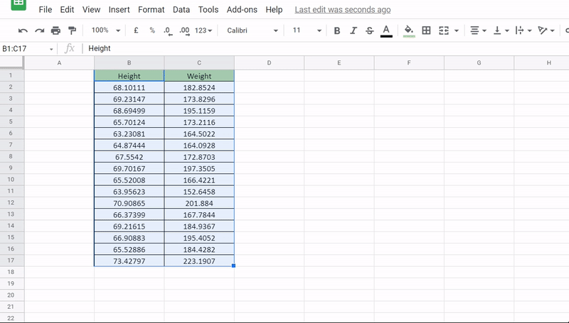
Step 2: Select the data. Click top left cell(B1) hold the cursor and drag down to bottom right cell C17.
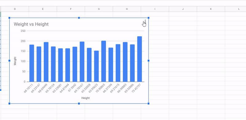
Step 3: Goto Menu Options -> Insert -> Charts. 99% of the time Google Sheets should automatically detect the type of data and create a scatter plot. But if it doesn’t follow step 4.
Step 4: Say you got a Column Chart instead of Scatter Plot. To change the chart type you’ll have to goto chart editor and from the Chart Type Dropdown choose Scatter Plot.
Step 5: Formatting the Scatter plot.
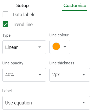
Step 6: Under Customize , goto Series -> Weight-> Tick the Trendline check-box.
To also add the trendline equation/formula goto label and select “Use equation”.

Note:
1) Instead of linear you can use Exponential, Polynomial, logarithmic line of best fit as well.

2. You can play around with Trend line formatting using options like Line Colour, Line Opacity, Line Thickness etc.
How to Interpret Data using Trendlines
So, now we know how to add Trendlines. Let’s now understand how to read and interpret it.
Looking closely at the Triangles, we can see that as the height increases, so does the weigh on an average. This fact is also reflected in the trendline which we have added.

Using the trendline equation obtained before, (y = 5.72*x -205), we can simply plugin any value of Height(in x) and get the associate Weight(as y).
Above example was fairly a simple one with lesser number of data points for easy understanding. In real life you can plugin to get a more accurate trendline like below.

Free Resources
Before we leave, feel free to grab a copy of the templates discussed in this tutorial in your personal Google Drive.
*Create a copy instead of requesting access
That’s it on this topic. If you still have any questions, then drop a comment below. Keep browsing SheetsInfo for more such useful information 🙂