Scatter Plot(also known as XY Charts) are useful to understand the raw spread of data points across a two-dimensional plane. It helps understand the data distribution and level of correlation with the between the two datasets mapped on X & Y Axes.
Lets try to understand the step by step process of creating & interpreting a Scatter Plot. We’ll also cover how trendlines can be used in this regard.
So let’s dive in.
Table of Contents
Creating a Scatter Plot in Google Sheet
We will be following the below steps to create a scatter plot in Google Sheets:
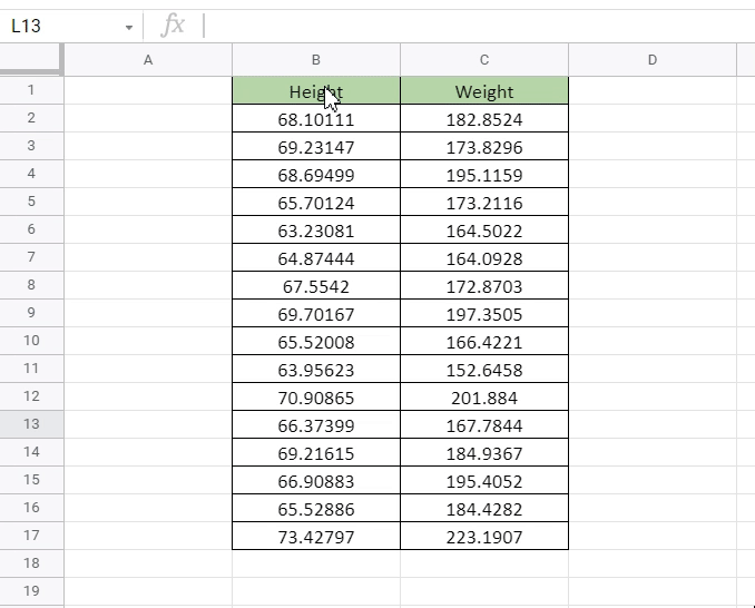
Step 1: Get the data you want to create a Plot with. We have used a sample Height vs Weight data available on Kaggle.

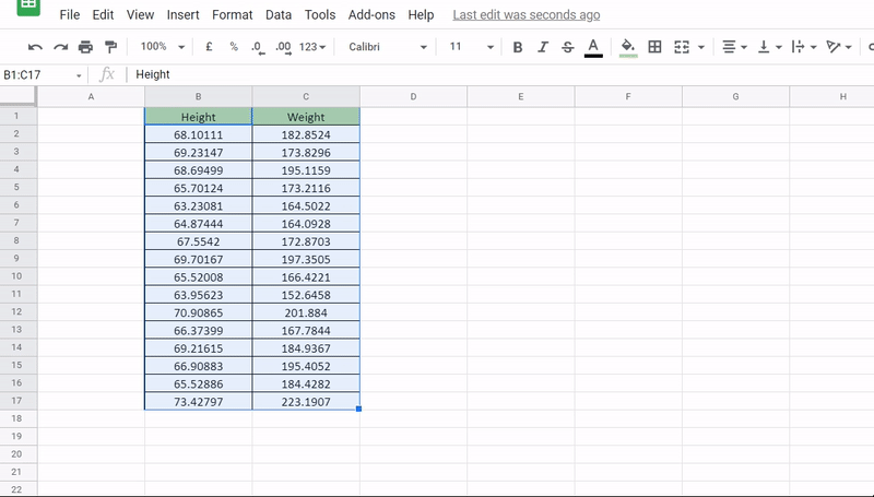
Step 2: Select the data. Click top left cell(B1) hold the cursor and drag down to bottom right cell C17.
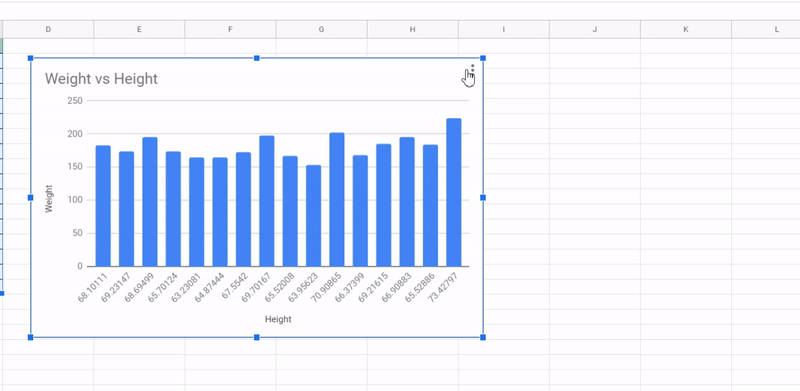
Step 3: Goto Menu Options -> Insert -> Charts. 99% of the time Google Sheets should automatically detect the type of data and create a scatter plot. But if it doesn’t follow step 4.
Step 4: Say you got a Column Chart instead of Scatter Plot. To change the chart type you’ll have to goto chart editor and from the Chart Type Dropdown choose Scatter Plot.
After, following the above 4 steps your plot will be ready.
Formatting the Scatter Plot in Google Sheets
While the plot we created in the last section would work just fine, if you need you can make further formatting enhancements to it. Like:-
- Modifying Axis and Char Titles
- Improving Fonts Size, Color etc
- Changing Color & Size & Shape of the bubble
- Editing Min and Maximum Thresholds of the X-Axis and Y-Axis
- Adding Trendlines or Error Bars
Most of the above are very easy to execute using the Chart Editor Options.
Below is a Clip of making some of these changes in action.
Adding Trendline to Scatter Plot in Google Sheet
Before we move on to interpretation of Scatter Plots, lets learn insert a trendline first.
Under Customize , goto Series -> Weight-> Tick the Trendline check-box.

To also add the trendline equation goto label and select “Use equation”.
Interpreting the Scatter Plot and How to use Trendlines
So, now we know how to create a scatter plot. Let’s now understand how to read and interpret it.
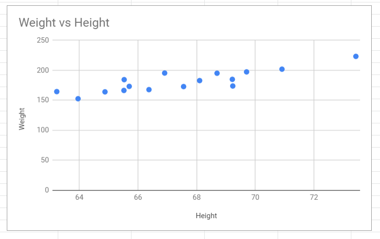
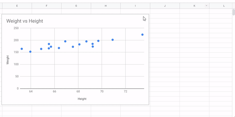
Looking closely at the Triangles, we can see that as the height increases, so does the weigh on an average. This fact is also reflected in the trendline which we have added.

It’s also clear that most data points are centered below the height 70. Post 70 we only have a two data points indicating low % of population with height more than 70.
Using the trendline equation obtained before, (y = 5.72*x -205), we can simply plugin any value of Height(in x) and get the associate Weight(as y).
Above example was fairly a simple one with lesser number of data points for easy understanding. In real life you can plugin much more points in the scatter plot to get even better insights, like below.

Free Resources
Before we leave, feel free to grab a copy of the templates discussed in this tutorial in your personal Google Drive.
*Create a copy instead of requesting access
That’s it on this topic. If you still have any questions, then drop a comment below. Keep browsing SheetsInfo for more such useful information 🙂