Timeline Templates are very useful for Project Management, Event Planning or simply to generate great timeseries view.
While there are freely available quality templates already provided by Google Sheets, you can also create one yourself.
In this tutorial we will go through a step by step process of creating a timeline chart from scratch.
So let’s dive in.
Table of Contents
Creating a Horizontal Timeline Chart
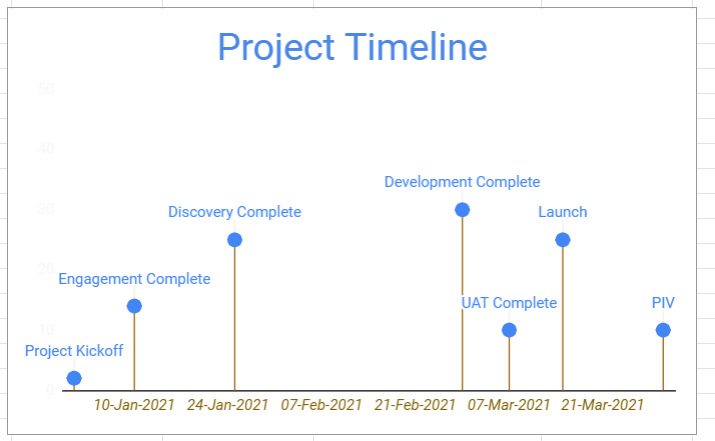
Below is a sample horizontal timeline chart which we will be creating. We’ll be using basic tools like Scatter Chart combined with a bit of improvisation to get this output.
Follow the below steps to create a timeline template in Google Sheets:
- Create a base table of Event Dates, Event Label and Position
- Select the Base Data and insert a Scatter Plot
- Format the Scatter plot to :
- Add Labels
- Adjust Margins
- Remove Gridlines
- Add Leaderlines
- Finally, apply the necessary color/font formatting as required.
Now let’s have a look at these steps in more detail.
Creating a Base Table
List down the timeseries event data in the following format.
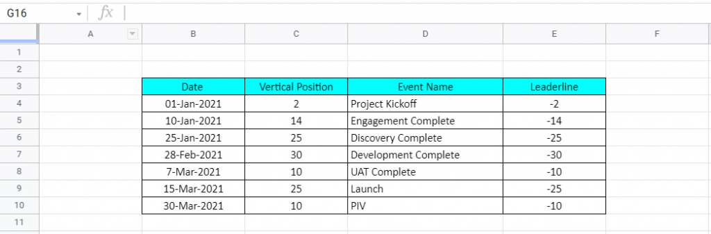
- Date is the Event Date
- Event Name is the Event Description
- Vertical position is the height of the event from the x-axis. Position is a randomly allocated number which will eventually help us in formatting our timeline view.
- Leaderline is simply the negative conversion of Vertical Position. This too will play an essential role in chart formatting.
Add A Scatter Plot
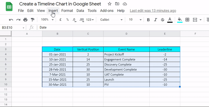
1. Select the Base Table

2. Goto Menu Options -> Insert -> Chart.
3. As you would notice Default Chart Type is Column Chart. Time to change this.
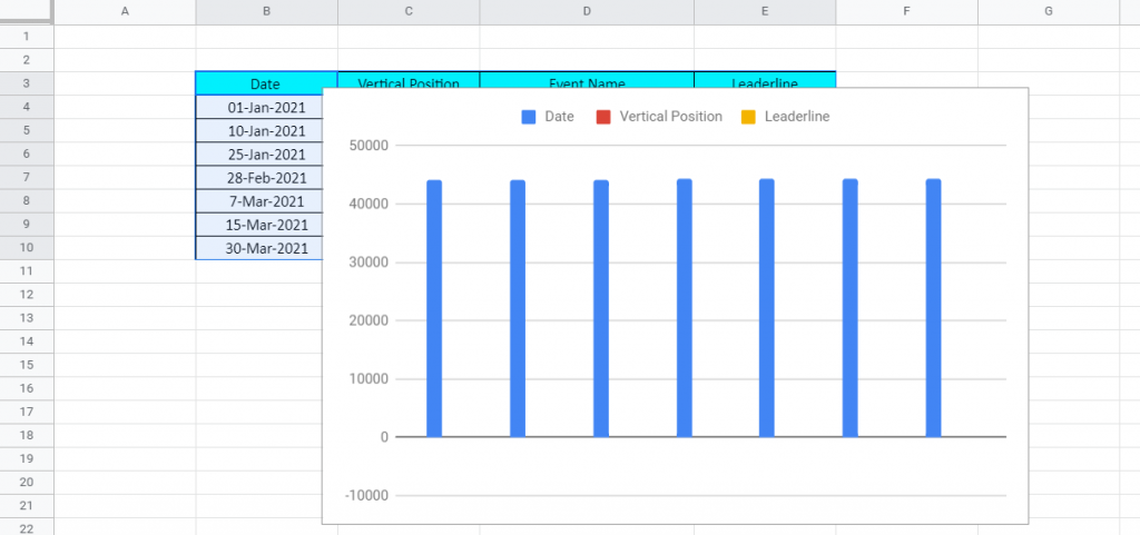
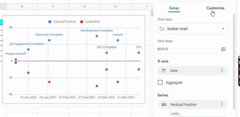
4. Double click on the chart to open Chart Editor Panel on the right. Select Chart Type Dropdown and Select Scatter Plot.

Editing the Scatter Plot
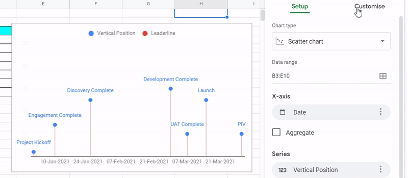
1. Add Event Labels: Goto Customize – > Series -> Select Vertical Position -> Check Mark Data Label -> Type Dropdown -> Custom

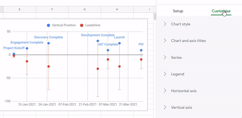
2. Add Error bars to Leaderline: Customize – > Series -> Select Leaderline -> Check Error Bars -> Type Dropdown -> Percentage & Value = 200
3. Resetting Vertical Axis to Start at 0:
4. Removing Vertical and Horizontal Gridlines (& Retaining Major Tick)

5. Hiding Vertical Axis Units by Coloring then White.

6.Removing Legend from the top.
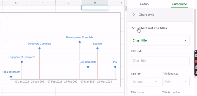
7. Adding Chart Title and Making it Center Aligned
This completes our Timeline Chart View Creation.
Formatting the Chart
You can further customize upon Font Size, Font Color etc to create a more formal looking chart. Like Below.

Not listing down the steps for this as it’s more of a personal choice.
Free Resources
Before we leave, feel free to grab a copy of the templates discussed in this tutorial in your personal Google Drive.
*Create a copy instead of requesting access
That’s it on this topic. If you still have any questions, then drop a comment below. Keep browsing SheetsInfo for more such useful information 🙂